Type
Website & Survey
Work
Research, Design
Role
Lead UX Designer
When
Mar 2021
Health Website Survey Design with User Testing
Cedars Sinai
Background
The LGBTQ+ community has unique barriers in getting properly screened for cancer, especially those that identify as a certain gender and go to typical doctors who don’t know the right questions to ask to assess their cancer risk. For many non binary and trans folk in the community, the topic of talking about their body can be very uncomfortable, and the goal of this project is to create a website and questionaire experience that asks the right anatomical questions while being mindful of a person’s gender identity.
Project Summary
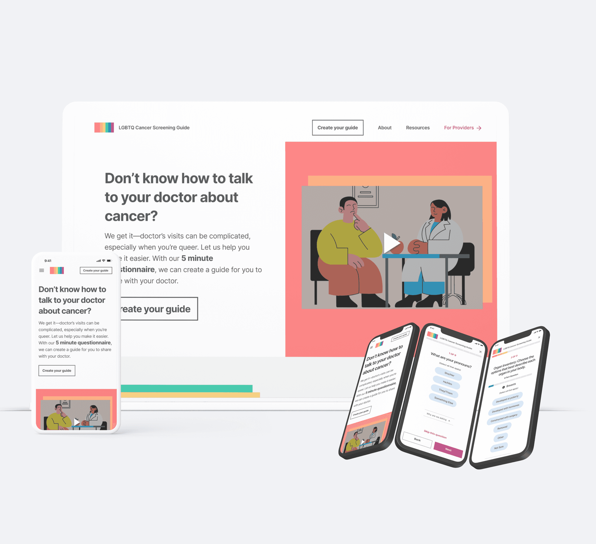
I helped Cedars Sinai craft a cancer screening website and questionnaire that filled a gap in the LGBTQ+ community. Through prototyping and invaluable feedback from LGBTQ+ user testers, I was able to deliver designs that could meet the specific needs of this community.
My Role
I planned and conducted user testing, created the wireframes and responsive designs in collaboration with health professionals who designed the content of the survey.
Wireframe Phase
I was given the cancer screening questions which were carefully crafted by health professionals from the hospital side, an informational video they wanted featured on the home page, along with home page copy and direction that there should be a resources and health professionals section. With this information I set off to create wireframes that we would go on to test with LGBTQ+ users.
User Testing
Testing Audience
Recruit 5 or 6 people from the LGBTQ+ community for user testing. We recommend that at least 3 of the people are either trans or nonbinary
Testing Format
1 on 1 for 1 hour via ZOOM
Testing Incentive
$25 Gift Card
Testing Goals
Identify any confusing or missing elements on the Home Page.
Identify any confusion for user navigating through the questions.
Identify any confusion for user to understand how to access personalized plan.
Key Findings
Organ Inventory Question
5/5 of the users pointed out potential confusion and vagueness of this question.
Clarify in a way that a trans person having had surgeries would be able to answer. This format doesn’t allow for a doctor to know what someone was biologically born with vs what might have been added later. Also consider adding a trigger warning to this question.
Home Page
4/5 Users did not get an accurate picture of what this was based on the home page screen
Improve understandability of what this tool is, what the output is, and why it is important to the community, and make it clear it does not connect you to a specific hospital or doctors.
Change the CTA to something other than ‘Plan’.
Most people skipped past the video and wouldn’t watch it at first so we cannot rely on it to tell people what the website is.
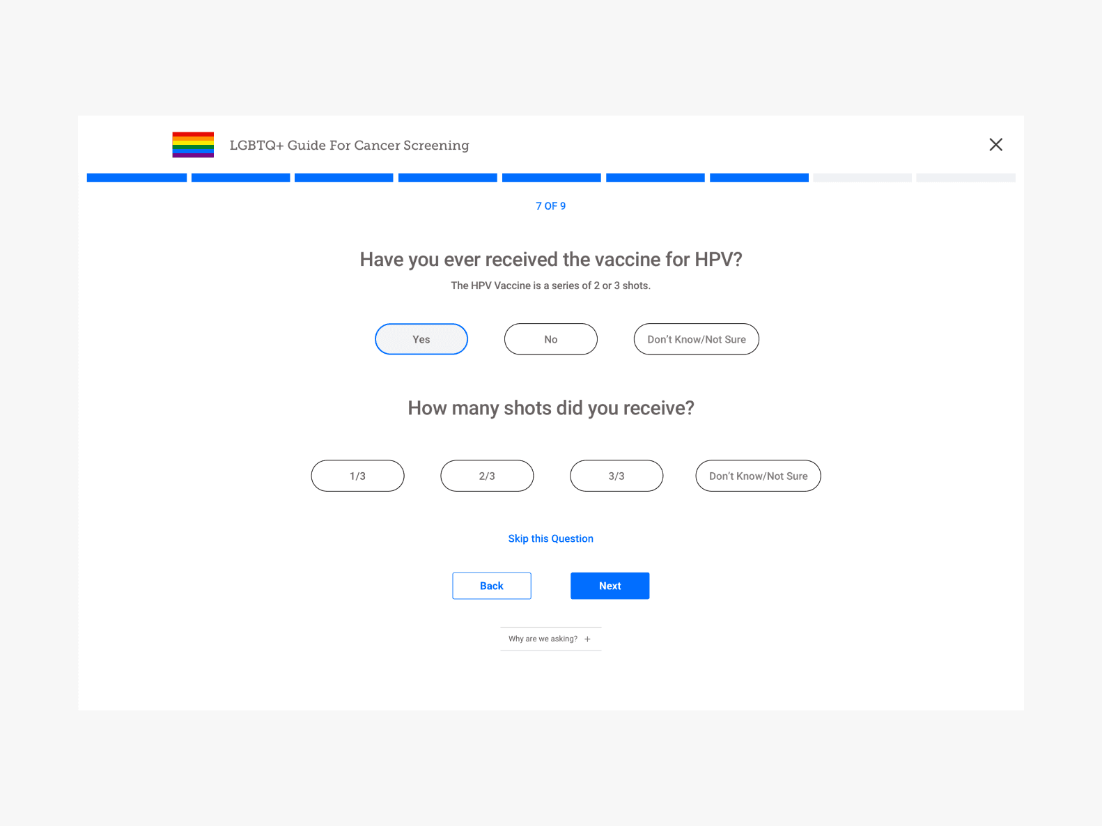
HPV Shot Question
2/5 of the Users had not received full set of shots.
We need to add room to specify how many of the three shots they have received
Second Iteration Wireframes
Organ Inventory Question
In collaboration with the health profressional we redesigned this question to still keep the organ based approach but to have more specific options to accomodate the range of events that might have happened to LGBTQ+ folks’ organs.
Guide the user to answer these in sequential order so they are not overwhelmed.
Room to enter in text for the ‘Other’ option.
Added informational overlays for people that might not be familiar with the anatomy and definition of the words.
Home Page
First thing I recommended we get a copywriter because from the user tests we saw how essential the copy was in understanding what someone is going to do on this website and what they will get in the end and why it is important.
I also changed the arrangement of copy and video so they could know what this website was without watching the video.
I directed that this section should highlight why this tool is important and why it might matter to the user. Before we had text saying that this tool was built based on research, but that wasn’t important to the user as much as the why.
I also decided to change the arrangement of the resource section to reveal some resources up front for the user so they don’t have to dig for them.
HPV Shot Question
Added a second part to the question to account for scenarios where users have not received all shots of this vaccine.
Designs
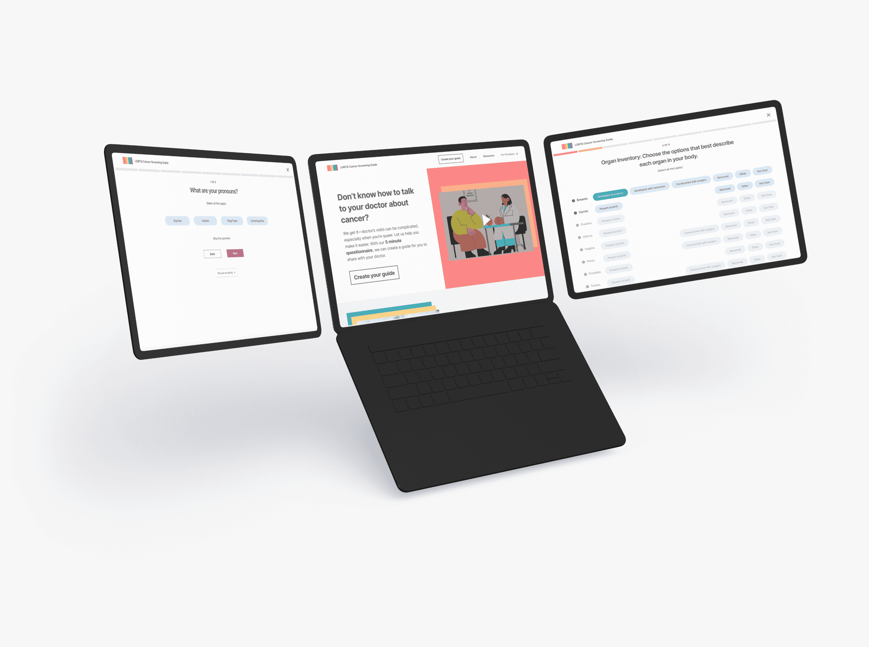
I was inspired to go big, bold, and colorful because that is the essence of the queer aesthetic- yet still professional so we come off as reliable and trustworthy.
Final Thoughts
This was a very enjoyable project to work on and was very fulfilling and rewarding, especially being part of the lgbtq community myself. It was also very refreshing and fortunate we had the budget for a round of user testing.


